~~~~~~~~~~~~~~~~~~~~~~~~~~~~~~~~~~~~~~~~~~~~~~~~~~~~~~~~~~~~~~~~~~~~~~~~~~~~~~~~~~~~~~~~`
Alright~ I've been waiting on an opportunity to lecture fellow newcomers of design. The urge started when horrible cards began flooding the market and people seemed to think that printing a deck is a no brainer. As long as they use the word "limited", the collectors will come rolling in and sweep their run empty. So here is some personal advice to both designers and buyers. As well as an... evaluation sheet of sorts to analyze the value of a deck's design.
Now everyone knows that there are two aspects to a deck - quality of handling and quality of design. Quality of handling can be essentially split into Stock and Finish, both very straightforward topics that I'm sure you already know. Design, however, is a much more sophisticated element. It is unique in that it doesn't seem to add or take away from the price of the cards, if that were the case the JAQKs and the Artifice would be around 30 bucks each and you should be able to get all Stephen Rook's goods for free. But, the design on a deck dictates the time spent producing the actual deck itself. You can spend a week on a deck or nine months - while you are not likely to be able to charge more for your cards, you can build up good credibility and ensure that people will continue to love your work, and it also helps raise the bar for custom cards on the market and make the world just that much of a better place. -Of course the reverse is also true. Rumours around that the guy who did Crimson Gate will continue to make cards. However, I for one would like it if he goes into the mountains and meditates for a couple years first. So how does one analyze the design of playing cards?
Many of you probably don't think the way I do. But if you did, why am I wasting my time typing this sentence? So this is how the design of a deck is broken down. I would say that it also splits into two categories, named
CONCEPT and
EXECUTION. Now, what do they mean?
CONCEPT is the "
Theme" of the deck, if you will. There really is no way to put a grade on concept, because it is always viable to opinion. I know that the forum likes to shun BBM for their excessive use of skulls and skeletons, but they still sell out quite easily. You can hate a theme but someone else may love it. But it is important to HAVE a theme. It makes a design interesting and unified. Themed decks usually win out over bland ones. So unless you can produce a design as timeless as the Tally-Ho's, get to brainstorming.
EXECUTION is the main, main aspect of a design and it separates flowers from weeds. It is a tell to whether thought and effort was put into this project or not.Before one can judge the theme, if the execution is sub-par, a deck and its designer will gain little credit.
What execution is is how well one carries out design. It is the overall layout as well as the minor details. The decisions as well as the craftsmanship. The judgement of execution is based on: One - a designer's creativity and knowledge of principles, such as is the design too busy, is it too shallow, is it too cartoony or too drafty. Are the placements aesthetically pleasing, are cliches being avoided,
And Two - His/Her actual skill at handling the programs, whatever that maybe, hand-drawing, even, to create the design he/she envisioned. Things such as - are the lines straight? Are your spirals of
consistent width? Are the proportions right on your figures? Are lighting and shadows where they're meant to be? Is the colour balance asthetically pleasing? Are the pips and indices pleasing to look at?
That sort of thing. To better explain, I will use some examples.
Here are examples of good execution.

1. The Outlaws are designed terribly well. The scripture is a forceful touch and the use of unorthodoxical layout proved to be very effective. The entity of the deck is consistent and flowing. Clearly well thought out and a lot of effort went into their production. One down side is that they failed to capitalie on the borders - which is what one looks at around 25% of the time cards are handled.
2. Russel's Americanas are flawless in their design. You can tell that not a single detail was left untouched, from the backdrop to the tone of colour to the accessories, are all perfectly combined with the original court card, as though they were supposed to be there in the first place. The theme is consitent throughout and shows heavy research.
3. The JAQK Cellars have got to be the forerunners of masterful card design - I don't know a company which did custom court cards before JAQK - nor any that made them as well as they did. The faces are just abstract enough to be comfortable to the eye, yet with enough complexity to show a tipsy expression. The outfits are decorated with much detail and colour and yet are not overpowering. The pips and indices suit classy wine excellently, and be it the Jokers, Box, Ace of spades or back, the Cellars maintain consistency and bring an air of class about them. My favourite design up to date.
4. Theme-wise, the dose are loathed by a majority of people. However, I cannot deny it the credit of execution. Though the theme is distasteful, they did a damn good job injecting it. In a simple looking back there is more detail than dozens of decks around the market today. The tape is photo-realistic, the grit and scratches really bring out the flavour of an asylum, and you can tell that the border has been worked to perfection. All the court cards were not only recoloured, as all lazy producers do on the market nowadays, but tweaked, modified and had things added to better deliver the concept. Though Sam Hayles`s design sense is very apart from my own, his skill is currently atop all those who design cards, I would say (Unless you count Si Scott, of course).
And now, here are some examples of bad execution.

1. Lance. T. Miller is a force in the world of custom cards - the Gargoyles were a solid deck, undoubtedly the best in Diavoli`s lineup (Which sadly isn`t saying much), and the Actuators have certainly taken
quite a bit of but Lance seems to have little idea of what Steampunk is - gears are SO much a small part in Steampunk art but it has become a stereotype. One cannot just draw gears in brown and say its Steampunk. Were you to look at the king of Hearts above, the head is a WWI pilot, the clothing looks like an arcade machine in the 80`s, and what on earth is he holding? A space-pistol with a spade on it? Research is CRUCIAL to good design. Do NOT go lightly on it.
2. It's no surprise that the examples of bad execution should come from the custom card companies - The Style Deck has certainly hammered down my expectations. First by showing that the back design is actually two large logos, and second by providing an enlarged shot of the court card, when I noticed that it looked like the Sentinel courts done on Microsoft Paint by an 8 year-old. And then when I thought of it, the back looks a heap like the Sentinels too. Sorry for saying that, Hatch.
3. The Crimson Gate - just what happened there? Came home after work and took 20 minutes to draw up a design and decide to try and have people pay for it? One it is hideously monotone, two, the middle is filled with SOLID GEOMETRICAL SHAPES, and three, the stuff, I can't call them symbols, on the border are stupidly shallow, I know they don't mean anything, but they don't even APPEAR to mean anything. There, have I said everything you wanted to say? Oh right, the actually put a star next to the Ace of spades to cover up the copyright symbol, looks like someone doesn't know how to delete.
4. These are the cards I have nightmares about as a designer. Were I to go on about its nature it would take an entirely new thread.
Some final notes -
Importance of research
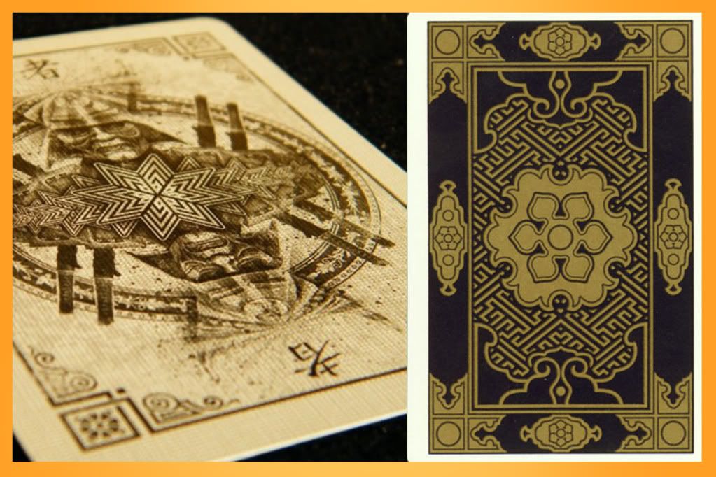
Just having good skill is not all! If you know your subject you will have much more success. Here is a comparison -

Both are of the Samurai Theme, but the one on the right, a deck that was European which I found on the WWW playing card museum, despite not having nearly as good graphics, stands higher for me than Sam Hayles Samurais. Because it gives a distinct Japanese feeling with its use of colour and symbolism.
Importance of Layout
Don't crowd your design. Examples of crowded designs -

See? Busy busy bad bad.
Importance of theme.
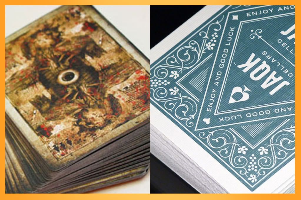
A deck with better execution isn't a better deck. Here is the comparison.

Dead Eyes are one of the most detailed decks ever to hit the market, there is so much effort that I shudder even thinking about it. But I'm sure the majority would rather opt for the JAQKs, as you can see in the image clearly less sophisticated but more elegant. Pick your theme carefully.
P.S - "Elegance" is NOT a theme.
In conclusion, when you make a deck, make sure it's something that you'll be proud of. If you make it solely on wanting to join the game and make some money, you'll get kicked out and none will come your way. And there is no need to moan about a new deck or a new company. It is their own job to prove themselves or be broke and removed. All for the advancement for the card community, and there will be, I'm certain, mind-blowing decks to come.


