I have recently designed my own deck of playing cards.
I’m not a designer but I always loved playing cards. My interest in them is mostly from the playing aspect, I love the idea of a game system and the versatility of them. And I love unusual designs. I don’t own many decks (less than 10) but love looking at interesting designs online.
I got into designing this set for three reasons: a) I had recently discovered game-icons.net, b) I designed my own version of Love Letter first which gave the direction of this specific style and c) I wanted more than 4 suits.
I’ve only designed them for myself, but I’d be happy to open the designs up on MakePlayingCards’s marketplace if anyone is interested. (I printed mine via MPC.) This is not a commerical project, just a fun hobby project.
I’ll explain some of my design choices. I have already found a couple of flaws which I have fixed in a new version. But before I’m going to print those, I’d love to get some feedback. I’ll show my improved version at the end.
 General design
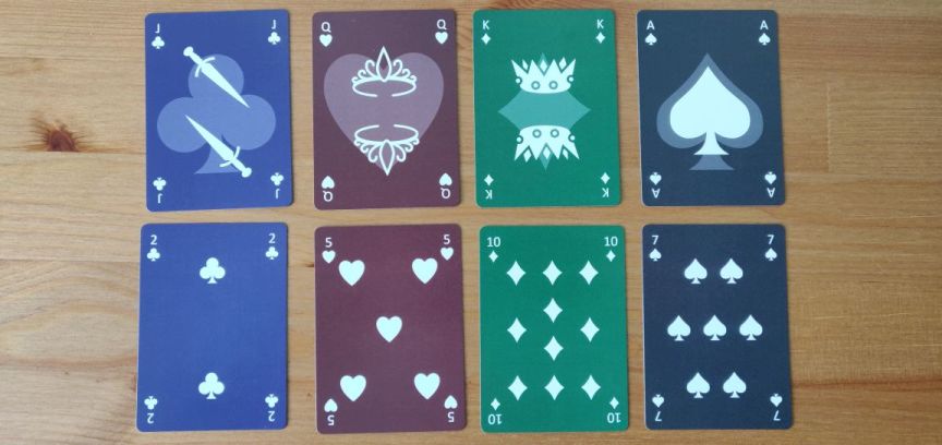
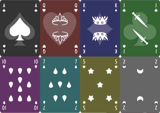
I like dark backgrounds and minimalistic, simplistic, flat, abstract designs. After making
my own Love Letter version recently, making playing cards in a similar style was the natural next step.
When I had the physical cards in my hands, I noticed that because every suit has its own background colour, you can sort of tell the suit from looking at the cards from the side in some situations. I wonder how much of a problem that would be in practice?
I tried to fix that by adding a same-coloured border to the front of the cards. But whatever I did, it never looked right. I think I’ll just live with that design flaw, unless I find something that works and looks good.
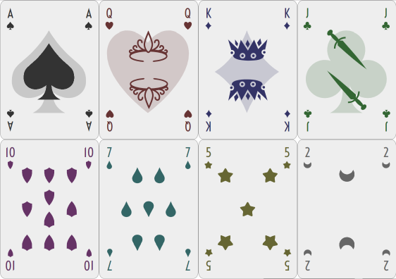
Instead I also designed a version with a light background. Cards from that will definitely not reveal their suit.
I’ve intentionally not mirrored the pips at first. I didn’t see the point because it only works well with even numbers. But when I had the physical cards in my hand, I found it more annoying than I anticipated, so the improved version does mirror the pips.
I’ve also intentionally made the distribution of the pips different to classic cards. That was mainly because it was easier to do this way.
The indices are in all four corners to make it possible to fan them in either direction.
I found the indices on the first version are a bit too small and I wasn’t happy with the font either. Both have been improved in the improved version. (It was actually quite difficult to find a good font for indices, that’s the main reason why it didn’t have a good one in the first version.)
 Suits
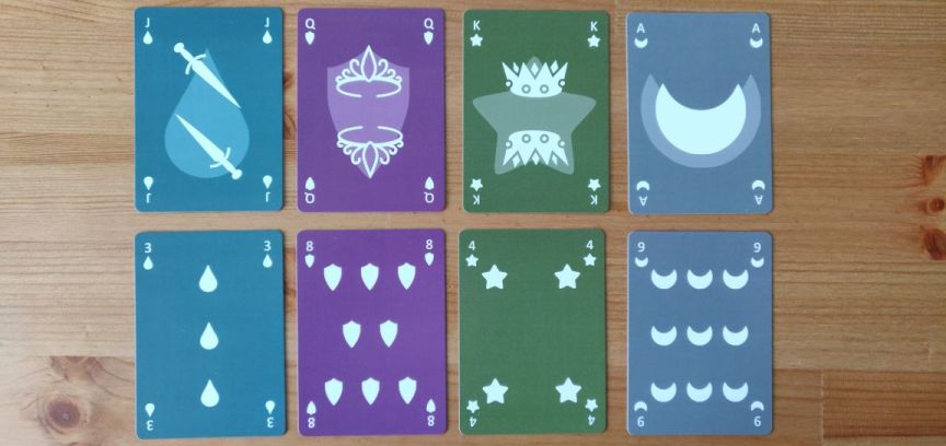
SuitsI originally only wanted one more suit (to be able to play Lost Cities), but then got into searching for good alternative suits and found four more suits which made sense and worked well.
I’ve looked a lot at other alternative suits, either from historic or modern decks. But I was really disappointed with most of them. They rarely fit the genius simple design of the French suits (diamonds, hearts, spades, clubs). One of the reasons why the French deck became so popular is because the suits are so simple that it’s easy to create stamps which made them easier and cheaper to produce.
Simplicity made them successful, so, whichever additional suits I would pick, they’d have to be as simplistic. And something else I noticed: They all have at least one curve and one spike and are vertically symmetric. (Diamonds don’t always have curves, but some variants have, like the one I used here.) I tried to find suits which would meet those criteria.
So, I chose: shields, drops, stars, moons.
The stars don’t have curves either, but they could have. The reason why I had to have stars is because that is the one constant alternative suit that appears everywhere. And it pairs well with moons. It makes sense and was the first one I’ve chosen.
I always liked the thought of four-colour decks. I’ve never owned one but have read about them. Naturally, I wanted my deck to have four coloured suits as well. They make it easier to distinguish the different suits, although in some card games they will make pairing more difficult because there are no two red suits and two black suits anymore.
I intended to use the most common four colours but somehow got the diamonds and clubs colours mixed up. I fixed that in the improved version.
The other colours fit the theme of the other suits: Shields is purple is royal, drops is teal is watery, stars is yellow(ish) is shiny and moons is grey is nighty.
 Ranks
RanksThe face cards are quite minimalistic. I didn’t want to have any unnecessary elements. I chose to add the transparent suit to the background rather than a single solid suit to the side to make it more symmetric and less in the way of the simplistic design.
I love designs which somehow merge the face and the suit. But I don’t have enough design skills to pull something like that off.
I played around with mirroring the background as well. It would make more sense but then it was more difficult to see the main image in some cases.
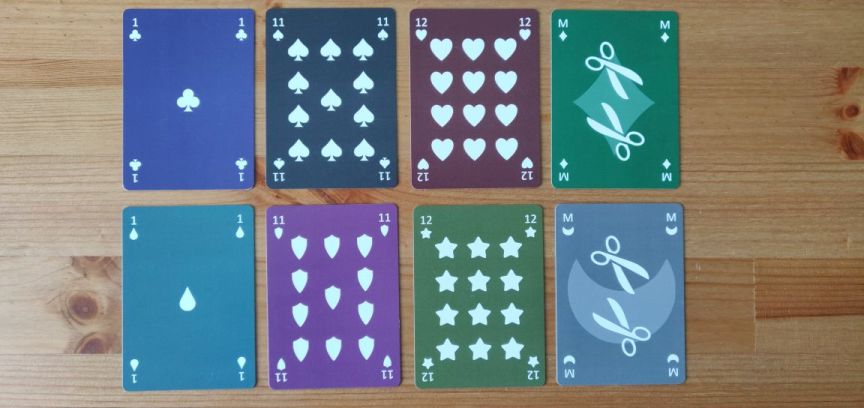
I originally only wanted one more rank as that already existed (historically and in a Tarot deck). But when I had to print amounts of cards that were dividable by 18 (or I would have to pay for blank cards), I also added 1 (which is used in some other decks and makes it possible to use 1 and Ace differently), 11 and 12 (which fills the suit grid nicely and makes some historic sense, thinking of the duodecimal system).
But the main additional rank is the Maid.
A Tarot deck has the Knight as a fourth face card but I wanted something female. Other decks have a Princess but I didn’t find that fitting as there is no equivalent Prince. It does make sense to find a female equivalent to the Jack, as the Queen is the female equivalent to the King.
(Also, I like how “Jack Maid” sounds like “Check Mate”. ;-))
I’d like to add 2 more face cards, though. It would be good to be able to go back to the original three clear ranks (Knave, Knight, King). I have one high rank pair and one low rank pair. It makes sense to add a middle rank pair.
That’s the only thing that is still missing from my improved version. It is tricky to find a pair of nouns that are a) clearly of middle rank, b) clearly male and female and c) don’t start with J, Q, K, A or M.
Any ideas? (I’ve got a couple of ideas but none I find convincing.)
I’d be happy to go back down the Knight route, but that starts with a K and there is no clear female equivalent.
As for the images for the face cards, the higher pair has typical headgear, the lower pair has typical tools. No idea yet what typical X the medium pair can have. I hope that will be clear as soon as I’ve found a good new pair.
 Jokers
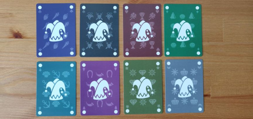
As with standard decks, the jokers are a bit more elaborate.
They pay tribute to all other alternative suits and show a transparent version of them in the background.
The four jokers in the standard suits show their equivalent Latin and Germanic suits.
The four jokers in the alternative suits are grouped by theme and show suits which are used in other alternative suits: Drops show anchors and shells, shields show horseshoes and horns, stars show steering wheels and jewels, moons show suns and crowns.
(The crown is the only symbol which doesn’t really fit into the theme of moons, but I couldn’t fit it anywhere else.)
I’ve also added a transparent suit to the jokers’ indices, so they can potentially be treated as other face cards. It also adds a way to distinguish them for colourblind people when fanning.
There is just a dot where the rank would be. Most decks use a star, but because the star was already taken for an alternative suit, I had to use something else. In the improved version I changed that to the reference symbol as I found the dot to be a bit too bold.
 Back
BackI wanted something simple and classic for the back. I added a border to prevent potential cheating. But because the front has different background colours, this deck will probably not be good for magicians. But the light version might be.
I’ve read that a dark background makes it more likely to show signs of wear and tear. But having a light background or border would look really weird with this dark design. So, I’ve kept it.
CreditsAll icons come from the brilliant
game-icons.net.
The font in the improved version is
Voltaire.
The design is my own, obviously inspired by hundreds of other decks.
The print is by
MakePlayingCards.
The graphic software I used to create the deck is… none!
I am a web developer and had started designing the deck in pure HTML and CSS. I had planned to move over a more sophisticated graphic design software, like Inkscape or The Gimp. But when I tried that it just slowed me down a lot. So, I stuck with HTML and CSS and made huge screenshots of each card.
And to my surprise the quality of the print looks as good as if I had used a graphics tool. You really cannot tell that it was not made with a more appropriate tool.
Improved versionWhat I have improved so far:
- Pips are mirrored
- Blue and green are swapped
- Indices are bigger
- Font for indices is more appropriate
- Joker “rank” symbol changed from dot to reference symbol ※ (not pictured)
- Added version with white background
What I still plan to add are two more face cards.
And the white background version. (The background is more of an off white, I might change that to pure white, don’t know yet.)
 Questions
I’d love to get general feedback on things I can improve.
Three main questions:
Any ideas for a good medium rank pair?
Do you know if having different backgrounds on the front of the cards can show the colour from the side and would therefore reveal the suit and be detrimental to playing with them?
What should I name this deck?
If I’m going to open this up on MPC’s marketplace, what would people be interested in? Dark or light? Poker or Bridge or other size? One deck of a whopping 162 cards or divided into 3 sub-decks of standard 55 cards (1x standard deck, 1x alternative suits deck, 1x alternative ranks deck)? “330gsm superior smooth” or “310gsm linen” card stock? This 4 or a more classic 2 colour deck (or rather 4 instead of 8 colours)?

 (Read 14285 times)