The more ink you use the more it costs to print the decks. This is why you don't see lots of color combinations - and it's why I'm being charged through the roof for the Vortex deck.
From the aspect of color theory, red and blue is the obvious choice for coloring. Let's look at the color wheel:
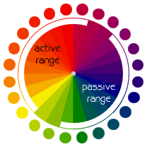
Red is opposite to blue, which is not only contrasting but also very vivid and visual. It is easy to see blue and easy to see red because they are the extremes in the light spectrum. This ideology goes beyond playing cards. Teams are often labeled "red" and "blue" and anything opposing is given red vs. blue color dynamics.
This works far worse for other color combinations. For example, purple and yellow. The two colors are very different, but on paper yellow is visually difficult to see. In fact, it blends with white far too easily. In gaming, "yellow" is VERY often mistaking for "white."
So what else would you use to contrast a green deck? Blue is far too similar, and red actually -does- work but red + green has symbolic meaning in the United States which is where mainstream decks are made. Also, red tends to overpower green since red is a strict warm color while green is halfway between warm and cool.
Oddly enough, the most visually striking color to the human eye is neither red nor blue. It's this shade of yellowish-green:
http://www.webdesignideas.org/wp-content/uploads/2008/07/fold-your-shirt.gifColor combinations within a deck of cards itself are rare because like I said - money is the issue. Orange is rarely used because it has to be contrasted to black otherwise it has no impact. Lots of black ink costs money.
Yellow must be contrasted with blue or black only.
Green is very versatile, but in terms of pleasing the eye does not work with orange, yellow, certain reds and certain purples.
Pink is very hard to match correctly, but does wonders with whites, purples, certain blues and certain reds.
Color theory is a very interesting subject to get into. I spend hours some days reading up on it. If any of you are interested in any kind of design I recommend getting into it.

 (Read 1593 times)