You are Here:

Show Posts

This section allows you to view all posts made by this member. Note that you can only see posts made in areas you currently have access to.


Messages - BlueToy

Pages: [1]
1
Thank you for your kind feedback - I'm glad you like the art :)
I might look into creating a poker size version in the future ...

Thanks again for stopping by to look :)

*wave*

The images look great, especially the suit of spades/swords. I think you only need to do some limited editing with the cards to turn them into bridge size (a little shifting of the figures to the sides).

-Ly

2
There you go!  :) While I like your Tarot deck, I think your playing cards look even more polished. One small thing I would have wanted (though the deck can stand as it is), would be some more obvious gradients in your joker card. But that's just me and my OCD when it comes to consistency. But like I said, the deck can still stand as it it, and it's such a minor point really.

3
Design & Development / Re: Sharing Some Stuff
« on: June 25, 2015, 11:46:14 AM »
Hello :)

Great so see your designs here  :D and nice to see the extension of your Tarocchi di Marcelo Inciso deck - Master Graven, cool name :)
To me, the King of Spades without the border line works the best... as the eye is drawn to the figure. I like the artwork, so my comments are just ideas on making the art 'pop' :)
Maybe tone down the 'rusticness' in the background to add more contrast between figure and background...? The design reminds me of old copper graphic prints (etchings) - you could see it as a balance between cleaning up the 'plate' and having enough ink in the etched lines to achieve the desired effect :)

I also like the earlier suggestions to make the background 2-way and move the indices a bit closer to the edge, as it would add to the 'playability' of the deck ;)

The King in your Planaren Karten deck looks as though he is sitting on a chair (sideways effect) - looking forward to seeing the other courts and where you end up taking this deck :)

Thanks for sharing - and *wave* :)

Thanks for the inputs! I'm figuring out a way to make the Master Graven's colors not to bleed to the edge of the card. I think it can still work as it is - superficially reversible until you notice the little discrepancies in the texture. But definitely no colors bleeding to the edge. It's a bit of an adjustment in outlook since bleed wasn't too big an issue with Tarot.

I've finished the queens of the the PlanarenKarten - though they seem a bit more elaborate than the kings (whose bold forms I like), so I might do a couple of tweaks or maybe change their entire design. Will post them n new threads dedicated to each series design, as was suggested earlier.

-Ly

4
Design & Development / Re: Print-On-Demand Printers?
« on: June 22, 2015, 10:18:42 PM »
The fulfillment service sounds appealing, especially to potential kickstarter projects. Their tarot cards are problematic, though. The maximum cards per deck in their system is 72 cards. A full tarot deck has 78 cards. A shame, really, since their tarot dimensions are wider than their competitors'.

5
Introduce Yourself / Re: Artist from Australia saying Hello
« on: June 22, 2015, 12:34:10 PM »
I know you! :D

Hope you share images of your works here soon! :D

6
Design & Development / Re: ACTIVE playing cards
« on: June 22, 2015, 09:26:16 AM »
Also, make the top heart in the 2 of Hearts upside-down.

An idea for your ace of diamonds (if you still want to change it): just add a faucet to it, with a couple of red drops dripping off. Maybe add a stick man with a glass, catching the drops. :)

-Ly

7
Design & Development / Re: ACTIVE playing cards
« on: June 22, 2015, 09:22:53 AM »
First off: wow! Pretty nice, playful concepts. I think this has the potential to be  really good deck!

My gripes are with consistency. If you will use multiple colors in the faces, make sure you use them on all cards. The same with gradients. Personally, I like the charming simplicity in your 3 of Diamonds and 2 of Hearts. I think this deck will work better with a red and black only color scheme - solid colors, no gradients. The scheme can work on all the cards you've done so far, for example, make the flames on the clubs a solid red. Also, remove the little black wave on the ace of diamonds, it can be misconstrued as part of the black oitline of the diamond - plus, the red wave works just as well without the black wave outline. Regarding the painting man cards (the ace of spades you presented earlier plus this new one), I think the base color should be red, with the man painting black paint over it - to indicate that he's recoloring it to the suit's natural color.

The blavk and white backs are really charming! Have you considered doing tarot designs? Your figures in this card back design have the potential to be applied to a tarot deck project. PM me if you need help on that one.

Overall: good job! Nice concepts, charming style. Just needs some reworking. Good luck! :)

8
Design & Development / Re: Stukeley Style Deck
« on: June 21, 2015, 10:26:47 AM »
Nice repro work! Cream ground really gives a more mellow look perfect for older styles of art. The images look intriguing, sorta like a cross between regular playing cards and the Tarot de Marseille, especially in the Leaves and Acorns suits. The arrangement of the leaves and acorns remind me a bit of Ogham.

Regarding the colors, I think they look great. Not too stark, but defined. That's always a problem with doing reproduction works - like, should you stick to the original colors the artist used (which were originally bright and gaudy but faded over time), or should you give it a faded, worn look as a nod to its vintageness.

9
Design & Development / Re: Sharing Some Stuff
« on: June 21, 2015, 10:15:32 AM »
BlueToy!

Hopefully you're aware of our 2nd Annual PCF Deck Design Competition?  It just started Wednesday!

Grand prize is that EPCC (the sponsor) produces your deck and you receive three gross (36 dozen) decks of it.

Last year's winner, the Evil Deck by Giovanni Meroni, is on sale NOW at the Conjuring Arts Research Center store.

http://www.playingcardforum.com/index.php?topic=8328.0

Thanks Don! Will look into it more and consider the possibilities. :) Or maybe I'll try to create a new deck jusg for the competition. :D

Any criticisms and suggestions on the samples I posted, as well as my current predicament?

Predicament?  What predicament?  Until the formal entries begin, you can offer up as many designs as you desire and are physically capable of posting!  Let the membership decide which one they seem to like the most, then make that your official entry.  Old designs, new designs - as long as they're your designs and haven't been previously produced.

My take on your designs...

Golden Court would make a lovely art deck, though the design as it exists now is terribly impractical.  In fact, it would almost work better as a series of art prints than it would as a pack of cards (though that's not necessarily a bad thing).  There are tweaks that could be made to make them more practical, but I think it might actually take away from the artistic value.  There's nothing wrong with an impractical deck if that is the audience you're aiming for - but you should know up front that the audience for artistic but impractical decks isn't as large as the audience for nice, practical ones!

You could actually make those to be completely "old school" by removing the indices and making a one-way court design.  It was popular among wealthy households, before playing cards were printed, to have handmade cards in the home.  Some homes had special sets that were made not on paper but on decorative card-sized slates of silver or gold, with the design engraved into the metal.  They were never played with, just displayed, but they were attractive and functioned as the medieval version of conspicuous consumption!  If you had enough money to have such a deck made and displayed in your home, you had a LOT of money!  You could modify this deck to give the appearance of one of those "conspicuous consumption" decks, but have it printed on paper.  There are companies that will print foil directly onto the card itself - the price is significantly higher, but they would be a lovely way to complement the design you've started with.

Sa Baranggay will be a popular deck, should you get around to making it - Filipinos love their cards, it seems.  The design with the Queen is most appealing - the background color is more muted and the look is more modern because of the "frameless" appearance.  The frameless courts look is very popular, and for good reason - it really shows off the art to remove the boundaries like that.

With Master Graven, you have a tough row to hoe.  Again, this might be a case where artistic merits are trumping practicality and you need to consider which way to go - make it more of an art project or more of a practical deck.  If you go artistic, stop worrying about being monochrome - there are plenty of monochrome decks out there, yours won't be alone.  If you go practical, yes, you will need something to distinguish the color - and more importantly, you'll need to clean the edges.  If you let your cards print into the bleed in these big broad patterns that look like grave rubbings, you'll in essence be creating a marked deck.  The edge differences from card to card will be visible, and with practice, one could use them to distinguish cards from each other.  The only way to prevent it would be to make them ALL identical in their pattern, at least at the edge where the card's die line is.  Even there, you'd still run the risk of off-center face prints screwing it up for you - not all printers are precise enough when it comes to alignment of backs and faces, and for those that aren't precise enough, they'll focus on making the back centered, to the detriment of the face's centering - the backs are more important to look uniform in appearance.

This could be another design that might look better really old-school - no indices, just a big suit pip and a one-way court image.  You can even square the corners - rounded corners, indices and two-way courts weren't common until sometime well into the latter half of the 19th Century CE, in the antebellum years following the American Civil War.  Even the joker wasn't invented until around that time - originally it was a trump card for the card game euchre - the name "joker" is a bastardized pronunciation of euchre, which I believe has Germanic origins.

Planaren Karten!  This deck would likely have the strongest appeal to a modern audience of all the designs you've displayed.  There's the old-fashioned feel to it in how the Kings look, all simple and blocky like some kind of folk art, but the art style also looks like something right out of an eight-bit video game.  This would be the most commercially viable of them all so far.  You get to combine nostalgia for old card design and nostalgia for old video games of the 1980s and 1990s into a single deck!  What hipster (and too-old-to-be-a-hipster-no-matter-how-hard-they-try) wouldn't want a pack of them?

Thanks for the feedback, Don! Sorry for being vague. By predicament, I meant this situation: I wana try to get my decks backed via Kickstarter but it's not available in the Philippines. Someone suggested I seek a partner to do the crowdfunding side (though I'm willing to do my share of that kind of work too). Have there been any successful partnerships like that in the past? Here or elsewhere?

I'm getting  a better feel of the vibe in the playing card world thanks to your comments. Like how important bleed is (heck, it's the first time I encountered the term marked decks being usedd to refer to bleed! I used to think they were only applicable to card backs). Thanks forbthe inputs on the designs too. Bit of hard choices I'll have to make on them. I really want to make the Golden and Graveb decks playable, so I'll do the changes some of you guys suggested and see if it looks OK.

I'm still reading through the contest rules (I wrongly got the impression that an artist can only sumbit one deck design),but I hope to join it.

10
Design & Development / Re: Sharing Some Stuff
« on: June 20, 2015, 01:18:04 PM »
BlueToy!

Hopefully you're aware of our 2nd Annual PCF Deck Design Competition?  It just started Wednesday!

Grand prize is that EPCC (the sponsor) produces your deck and you receive three gross (36 dozen) decks of it.

Last year's winner, the Evil Deck by Giovanni Meroni, is on sale NOW at the Conjuring Arts Research Center store.

http://www.playingcardforum.com/index.php?topic=8328.0

Thanks Don! Will look into it more and consider the possibilities. :) Or maybe I'll try to create a new deck jusg for the competition. :D

Any criticisms and suggestions on the samples I posted, as well as my current predicament?

11
Design & Development / Re: Sharing Some Stuff
« on: June 20, 2015, 01:11:53 PM »
Oh, I remember you. Nice golden cards. Not very practical, but nice.
http://playingcardcollector.net/2013/02/03/playing-card-art-by-blue-fusion/

By the way, you can find yourself somewhere here
http://www.playingcardforum.com/index.php?topic=4095.0

Thanks! I remember running into your site some time bacl and seeing my works there.:D


Also, was that attachment your suggestion on how I should improve the Planaren deck? I really wanted to stick to only red black and white for this project (as opposed to having some faded areas). Should I remove the decorative background instead?

12
Design & Development / Re: Print-On-Demand Printers?
« on: June 20, 2015, 10:30:09 AM »
A solution would be to get a domain (preferrably a short one! :D), say for example www.variantventures.com, anf then just have it redirect it to your PS page.

13
Design & Development / Re: Sharing Some Stuff
« on: June 20, 2015, 09:15:59 AM »
Very good illustrations. Golden Court looks beautiful but the index is somewhat hard to see and is too far from the corner for easy playing. The black border may cause some trouble due to bleeding at the edge. It could still sell if you marketed it purely for its appearance alone.

Is Master Graven based on the Tarot de Marseille? I think the red suits should be white but have a thick outline.

Thank you for the feedback! I've noticed that regarding the Golden Court. I'll try to incorporate the indexes into the picture frame-like inner border.

Regarding the Master Graven, yes it's inspired by the Tarot de Marseille.I've just recently finished creating a Marseille-style tarot in this style, called the Tarocchi di Marcelo Inciso, which made me think of applying the same visual style to playing cards. I'll be using the court's tarot counterparts as bases. I'll try the heavy outlining which you suggested. My main concern regarding outlining would be in making it look natural (like it was done in the medieval times as opposed to looking like something trying to look medieval but having obious modern additions).

14
Design & Development / Sharing Some Stuff
« on: June 20, 2015, 07:43:32 AM »
I've done some designs of playing cards over the years. I plan to resume working on them and finally finish them this year. I'm posting samples below, accompanied by short descriptions. I'd appreciate to receive feedback on them.

I'm looking into exploring crowdfunding sites to fund their printing. Would have wanted to use Kickstarter but I'm based in the Philippines, so I can't. A friend said I should try looking for a business partner or something  - and maybe I'll look into that (ever encountered a scenario like this?). At the very least, there's always the Game Crafter to fall back on.

Golden Court


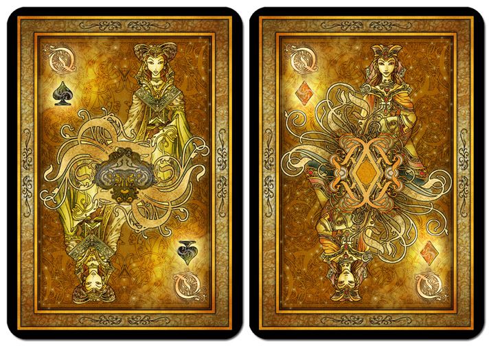
Something I did almost 10 years ago. I wanted it to have a medieval feel, and with a warm glow and color scheme reminiscent of leather-bound books. I didn't finish it because back then i didn't know how to get it printed. And I didn't like how I drew the figures. I also couldn't figure out how to execute the suits back then (I've only added the small suits in the sample image earlier today). I'm planning to revamp the figures and finish the deck. Some other samples of the pips can be found here (albeit without the small suit symbols in the corners yet): http://playingcardcollector.net/2013/02/03/playing-card-art-by-blue-fusion/


Sa Baranggay


The them is Colonial Philippines. I've finished the line art of the courts. The images in the samples show some possible final looks for the deck. I originally intended the pips to have an embroidered look. It works fine with the black suits - I'm just not entirely confident with the red ones (like, should I just do them in red and white?).
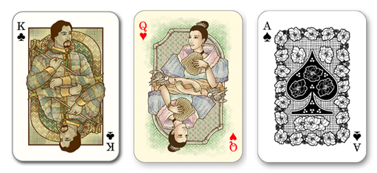


Master Graven


I've recently finished a Tarot deck done in the same style and wanted to see if I can adapt it to Lenormand and playing card design. (the figures are actually from the Tarot deck I did. I wanted to get feedback first and then redraw them after). The goal was for the deck to look like rustic woodcuts or rough engravings, or grave rubbings  - something old and medieval. My main problem right now is how to execute the red suits, given the monochromatic color scheme (row 2 shows the results of me toying around with the idea of rendering the initial and suit symbol in black and in white - though I'm leaning towards them being black based on the results). Also, "borderless" seems to be gaining popularity in tarot and Lenormand, so I thought I'd do a borderless sample (King of Spades) and get feedback for it.
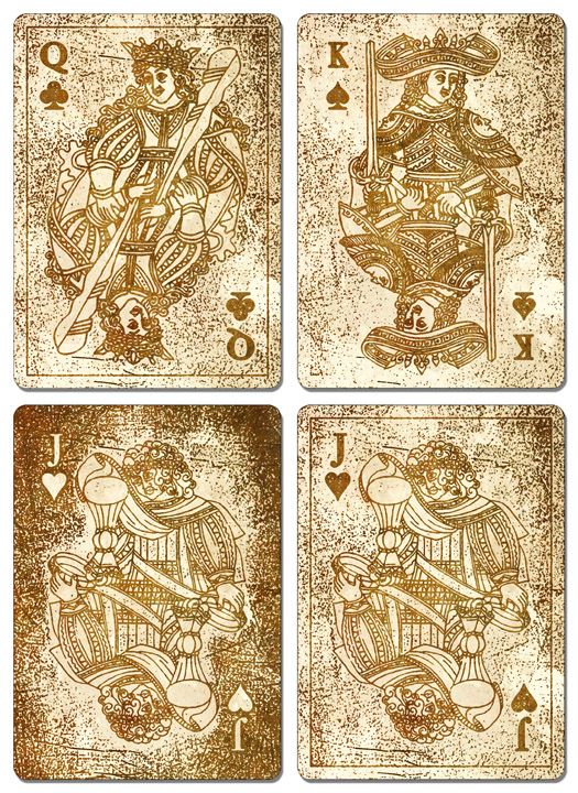

PlanarenKarten


I originally intended to adapt/modify Ditha Moser's wonderful planar art designs for her whist deck so that it would be more poker-friendly (move the suits to the corners), but I'm not sure of its copyright status (it was printed over 100 years ago). So I ended up creating this instead.


I enjoy experimenting with a lot of different styles. I've a couple more other sets I've done ,but I'd like to focus on these four first and see if I can get them funded/printed (and learn from the experience!).

-Ly

15
Introduce Yourself / Re: Hello
« on: June 19, 2015, 03:19:30 PM »
Thanks for the welcome! I'll try to explore the site more and post some of my stuff in the next few days.

16
Design & Development / Re: Wooden cards project
« on: June 19, 2015, 03:15:21 PM »
I think the line art alone (regardless of it being printed on wood) is great. My issue ( and a small one at that) is regarding consistency. The King of Diamonds' central suit is placed on a "shield" with the same shape as its suit - while all the other kings' aren't. But that's just me nitpicking. Beautiful design overall - it catches the eye even without colors.

17
Design & Development / Re: Print-On-Demand Printers?
« on: June 19, 2015, 03:10:12 PM »
Also, how do Printer Studio and MPC (which are Hong Kong based) compare with US-based printers in terms of shipping abroad? One of the recurring issues I've encountered regarding TGC (which is US-based) is how expensive it is to get a deck shipped outside the US. Then again, that might be a USPS thing. (I actually dunno, since I'm based in the Philippines)

18
Design & Development / Re: Print-On-Demand Printers?
« on: June 19, 2015, 03:03:50 PM »
@Don - Thanks for the info. I have never encountered Print Ninja nor Card Shark before. Will look into them. It's a good thing there's lots of POD type of printers nowadays. You couldn't fine any of these 10 years ago, at least not online. I used to had to make do with other printers back then.

Regarding the 'darkening' thing, what I do is have a deck printed, and then compare it with how the deck looks on my monitor and then do my color adjustments. It's quite tedious, though. I thing TGC has color calibration specs, but I never could understand how to apply these to Photoshop. :D

@Variantventures - Thanks for the link! I didn't know Printer Studio offered a storefront to indie publishers! Do they show the prices already marked-up? I tried navigating through their site to test how easily I can locate individual storefronts, and it took a bit of time.

I also actually remember you from Aeclectic - I came upon your deck's thread. The Mamluk deck's been one of my dream projects to take on (will do this, maybe next year, though totally different from your own deck - which I think is great).

19
Design & Development / Print-On-Demand Printers?
« on: June 18, 2015, 12:18:02 AM »
Apologies in advance if this topic does not belong to this section. I figured that since it involves printers, it's part of the "development" process of a deck.

Anyway:

A.) What print-on-demand printers are you aware of?

B.) What's your opinions on them and their products and services?

Here's my share:

A - I'm only familiar with  3: The Game Crafter, Printer Studio, and Make Playing Cards, and I've only used Game Crafter (because they're the only ones which have a store front option).

B - In my case, as I've only dealt with The Game Crafter, I find their card stock a bit on the thin side - but adequate, although they've recently upgraded their card stock, though I've yet to try out this new stock. Plus, I really like the fact that they have the store front thing - they handle everything, in terms of order fulfillment (for a fee, though).

People in the tarot forum I frequent swear by Printer Studio's linen stock, though there was this person who had the same design printed by Printer Studio and Game Crafter and Printer Studio's came out darker that what the designer expected.

I have read it mentioned here that Make Playing Cards' card stock isn't too good, or at least isn't top notch. I do like the fact that they do custom dimensions - for a fee. I dunno if Printer Studio offers this, but I know Game Crafter doesn't.

20
Introduce Yourself / Hello
« on: June 17, 2015, 11:16:52 PM »
Hello! I've just recently discovered this forum while looking for communities of playing card enthusiasts online.

I've done a number of tarot decks in the past, and have a couple of playing card designs I want to finish/fine-tune. My card-related art can be found here: http://paralumanstudio.blogspot.com/ (the playing card section's a bit bare - the site itself is pretty new and I haven't yet gotten around to uploading some of the other playing card designs I've done).

I hope to learn more about playing cards (history, development, taxonomy, etc) here as that's been my interest even before tarot.

I'm looking forward to interacting with the folks here. :)

-Ly

Pages: [1]